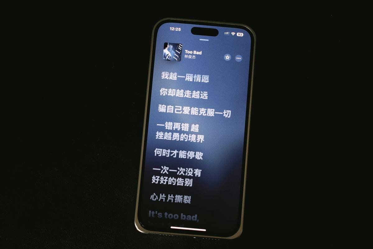
Ever stared at a video draft so cluttered with subtitles that it felt like your brain was hosting a chaotic brainstorm session? Yeah, we’ve all been there. But what if you could turn this headache into a sleek, visually appealing masterpiece—one layer of text at a time?
Welcome to the ultimate guide on overlay text layering in subtitle apps! By the end of this article, you’ll not only understand why this technique is crucial but also gain actionable steps, insider tips, and real-life examples to elevate your content game. Let’s dive deep.
Table of Contents
- Introduction: Why Overlay Text Layering Matters
- The Problem With Traditional Subtitles
- Step-by-Step Guide to Perfect Overlay Text Layering
- 5 Tips to Ace Your Text Layers Like a Pro
- Real-Life Case Studies: Success Stories from Seasoned Creators
- FAQs About Overlay Text Layering
Key Takeaways
- Overlay text layering enhances clarity and engagement in videos by organizing information effectively.
- Using dedicated subtitle apps streamlines the process, especially when balancing productivity and wellness goals.
- A poorly executed overlay can lead to distraction—or worse, viewer drop-off—so precision matters.
Introduction: Why Overlay Text Layering Matters
In today’s fast-paced digital world, attention spans are shorter than ever. If you’re creating content meant to inspire or educate (ahem, health & wellness creators), nailing visual communication is non-negotiable. This is where overlay text layering in subtitle apps comes in clutch.

But let’s be honest: poor execution can make even the most meaningful message look messy. Have you ever seen those cringey YouTube tutorials where every line overlaps another? It’s enough to make anyone press “skip.” Don’t worry—you won’t find yourself in that camp after reading this post!
The Problem With Traditional Subtitles
To illustrate, I once spent two hours editing a motivational speech clip…only to realize I’d accidentally overlapped three lines of text smack dab in the middle of my speaker’s face. Ugh. Total rookie move. Not only did it block their expressions—it made viewers zone out faster than you can say “closed captions.”
“Grumpy Me:* ‘Why bother?’
Optimist Me: ‘Because done right, these layers add depth without chaos.’*”
Traditional subtitles often lack structure—they pile words onto each other without considering spatial hierarchy or design flow. The result? A sensory overload akin to hearing nails on a chalkboard while trying to focus. Sounds familiar?
Step-by-Step Guide to Perfect Overlay Text Layering
Step 1: Choose the Right App
The first step toward mastering overlay text layering starts with picking the right tool. Look for advanced features such as drag-and-drop functionality, customizable fonts, and transparency settings. Some popular subtitle apps include:
- Descript: Great for podcasters and YouTubers alike.
- Kapwing: User-friendly interface perfect for beginners.
- Adobe Premiere Pro: Ideal for pros seeking granular control.
Step 2: Map Out Your Layers
Before jumping straight into editing, sketch out how many text elements you want and where they should go. Think about prioritization: What’s the most important piece of info? That goes front and center.
Step 3: Play Around With Opacity
Transparency isn’t just an aesthetic choice—it prevents text from overpowering visuals. Aim for 70%-80% opacity for maximum legibility while keeping distractions minimal.
Step 4: Add Contrast for Clarity
If your background image is dark, use bright white text; if light, opt for darker shades like navy blue or charcoal gray. Remember: visibility = retention.
Step 5: Test Before Publishing
Preview multiple devices before publishing. Sounds tedious? Maybe—but trust me when I say it saves countless awkward DMs later.
5 Tips to Ace Your Text Layers Like a Pro
- Keep It Short: Limit phrases to no more than six words per line to avoid overwhelming viewers.
- Prioritize Readability Over Creativity: Sans-serif fonts work best for small screens.
- Don’t Ignore Sound Cues: Sync subtitles closely with audio cues for seamless viewing.
- Use Animations Sparingly: Slide-ins or fades are cool in moderation. Too much movement distracts.
- **Avoid Terrible Tip #1:** Never slap neon green Comic Sans across someone’s carefully curated wellness montage unless sarcasm is your goal. Trust me…just don’t.
Real-Life Case Studies: Success Stories from Seasoned Creators
Tina R., a fitness influencer based in California, credits her recent subscriber spike partly to adopting overlay text layering techniques. Her secret sauce? Minimalistic yet impactful overlays paired with calming voiceovers—a recipe for success among wellness enthusiasts.
Another creator, Marcus D., doubled his Instagram Reel views by strategically placing key takeaways near focal points within his shots. His mantra: “Less clutter equals more clicks.”
FAQs About Overlay Text Layering
What Exactly Is Overlay Text Layering?
Simply put, it involves stacking text elements thoughtfully over video visuals to enhance messaging without disrupting aesthetics.
Is It Only Useful For Videos?
Nope! While primarily used for videos, overlays can spice up presentations, infographics, and social media carousels too.
Which Tools Are Best For Beginners?
Kapwing and Canva offer intuitive interfaces ideal for newcomers. Advanced users might prefer Premiere Pro or Final Cut Pro for added customization.
Conclusion
Mastering overlay text layering doesn’t have to feel daunting. Armed with the right tools, strategies, and mindset, you’ll transform chaotic drafts into polished works of art—effortlessly boosting productivity and viewer satisfaction along the way.
Remember: Good content speaks volumes. Great content shouts—and whispers—all at once.
Like dial-up internet speeds,
Your creativity needs space to breathe.
Stay calm, stay sharp.


